
Catalogue app
What it is like to live here
A figure on its own says nothing. This app puts your municipality next to its neighbours across seven indicators, projects the time series forward and looks for the ones out of line — computing all of it inside your browser.
The app travels inside the link: it opens in your browser and stays there. No account, nothing to install, and none of your data passes through a server.
What it does
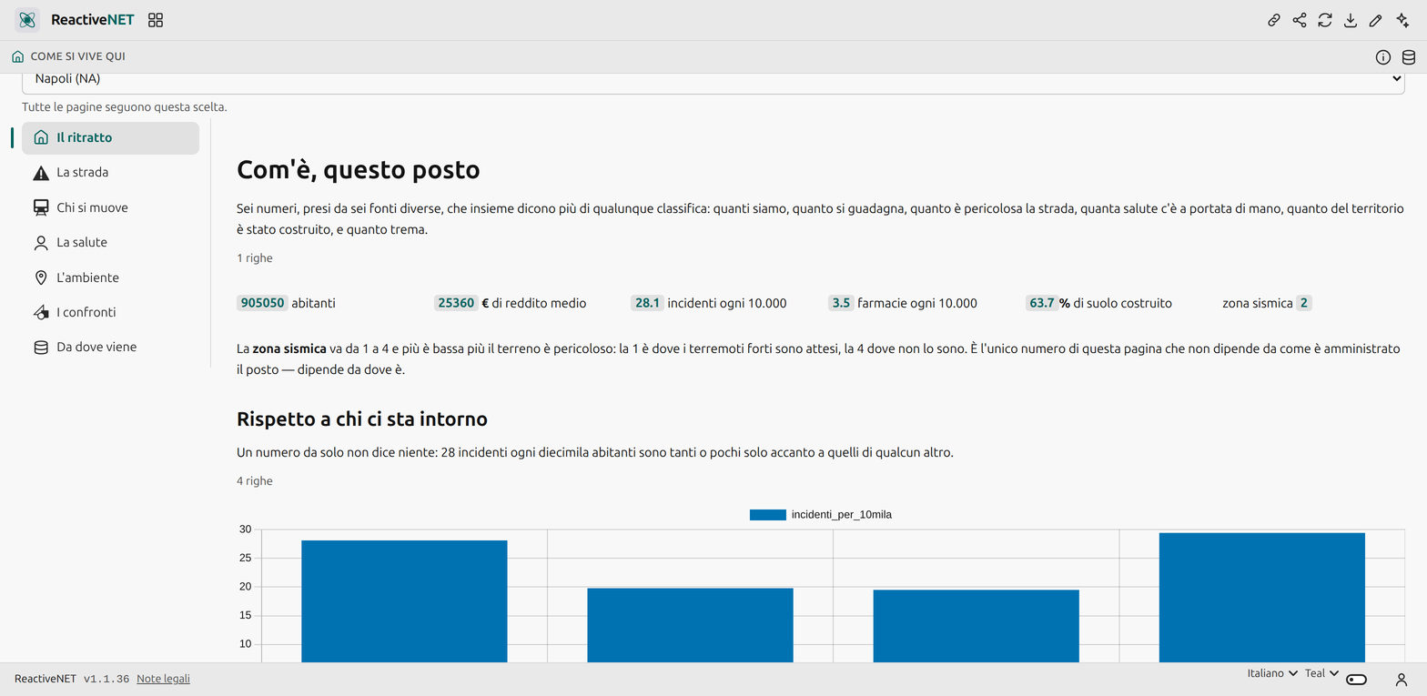
You pick a municipality at the top — all 7,896 of them — and seven pages fill up.
The portrait lines up six figures from six different sources: how many of us there are, what people earn, how dangerous the road is, how much health care is within reach, how much of the territory has been built on, and which seismic zone it sits in. Below, the same figure next to the province, the region and Italy, because that is the only way to know whether a number is high.
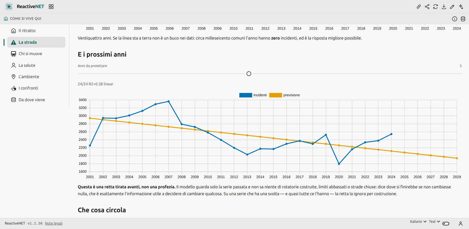
The road is the accident series since 2001 with its projection, and the vehicle fleet by Euro class. Who moves says how many people leave each day and how many arrive, and by what means.
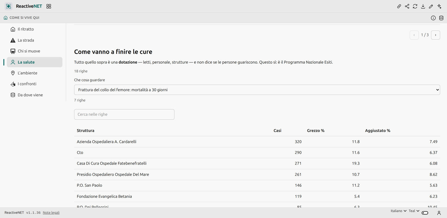
Health starts from the question no health portal answers — which health authority is mine — and then shows the catchment’s hospitals, how many doctors and nurses work there, how care actually ends facility by facility, the municipality’s family clinics and the diagnostic machines on a map.
Environment is built-on soil period by period and recycling year by year, with kilos per resident next to the percentage: sorting a mountain of waste well is still worse than producing less of it.
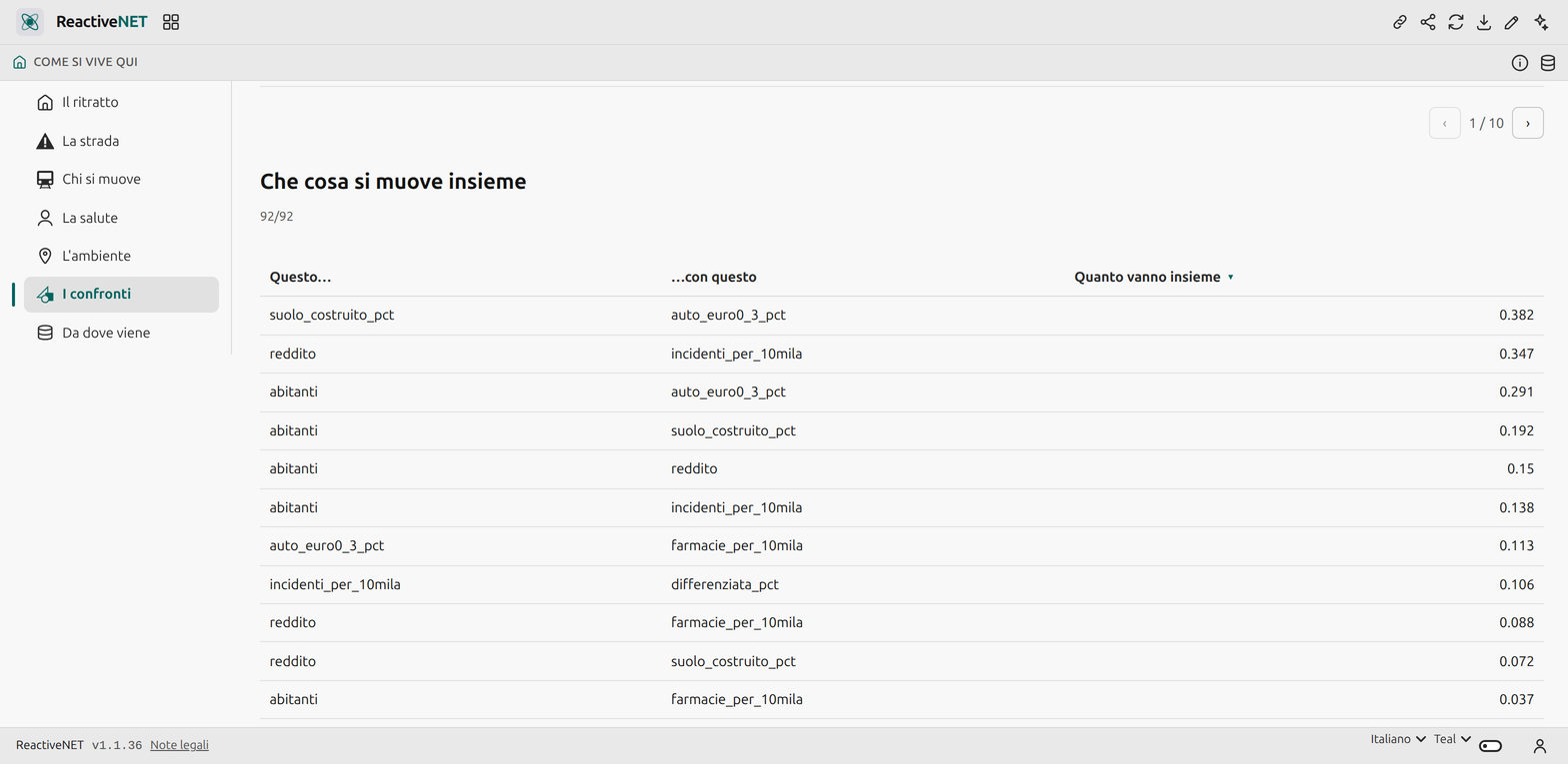
Comparisons is the page that stops looking at one municipality alone.
The machine learning, and why it is honest
Three analyses run in the browser, over data it has already downloaded:
- a projection of the accident series, with the horizon chosen by the reader. It is a straight line pushed forward and the page says so: the model knows nothing about roundabouts built or limits lowered, and on a series with a turn it ignores it by construction;
- the correlations across the seven indicators of the province’s municipalities — which things move together. Next to it sits the sentence that makes the page useful rather than dangerous: two things that move together are not one the cause of the other;
- anomaly detection, flagging municipalities that do not resemble their neighbours. An unusual municipality is not one in trouble: it may be the provincial capital, the town with the motorway beside it, or an error at source. The model says where to look; whoever looks decides what they found.
There is no model trained elsewhere, no precomputed ranking, and no data leaving: these are sums done in front of the reader, which is why their parameters can be changed.
Where the data comes from
Eleven official sources: ISTAT (population, road accidents, commuting), the Treasury (incomes), ACI (vehicle fleet), the Ministry of Health (health authorities, hospitals, staff, equipment, family clinics, pharmacies — all under the IODL 2.0 licence), AGENAS (care outcomes), ISPRA (land consumption and waste), and the Civil Protection Department (seismic zones).
The app’s last page lists them all and explains the four things you need to know in order not to misread them — starting with the most treacherous, that beds per resident are deliberately not computed: a hospital does not serve the town it stands in, it serves the authority’s catchment.
Yours to change
An app is a Markdown document: open it, edit it by hand, or ask the assistant to change it for you. Whatever you add stays on your device.