
Catalogue app
Health where you live
Anyone looking for “the health data for my town” finds numbers hanging off an entity whose name they do not even know: the health service publishes per authority, and there are 110 of those against 7,896 municipalities. This app starts there and goes all the way to the only question that really counts — whether people get better.
The app travels inside the link: it opens in your browser and stays there. No account, nothing to install, and none of your data passes through a server.
What it does
You pick a municipality at the top — all 7,896 of them — and nine pages fill up.
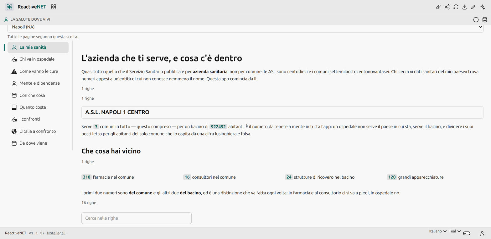
My health service answers the question everything else depends on: which health authority serves this municipality, how many municipalities it shares it with, and what is nearby — pharmacies and family clinics in the municipality, hospitals and equipment in the catchment.
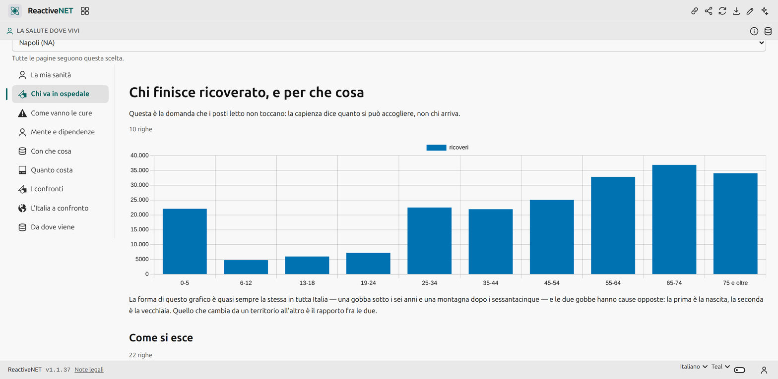
Who goes to hospital is the question bed counts cannot touch: capacity says how many can be taken in, not who arrives. Admissions by age, how people leave (home, on to another facility, or not), and trauma.
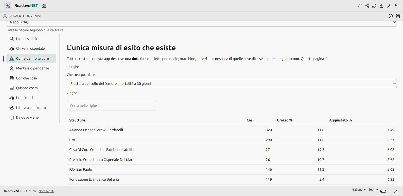
How care ends is the National Outcomes Programme: thirty-day mortality, hip fractures operated in time, facility by facility and adjusted for how ill the arriving patients were.
Mind and addiction covers the two services people talk about most and find the fewest numbers on. What with counts doctors and nurses and maps the CT and MRI scanners. What it costs opens the authority’s cash accounts, line by line.
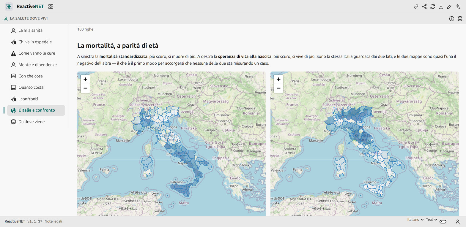
Italy compared is the one page that looks at every territory rather than one: the hundred provinces on two maps, age-standardised mortality and life expectancy, from ISTAT. Standardised is the word that carries it — a province with many old people has more deaths than a young one without anybody being worse off, and the crude rate would say exactly that.
The three analyses, and why they are honest
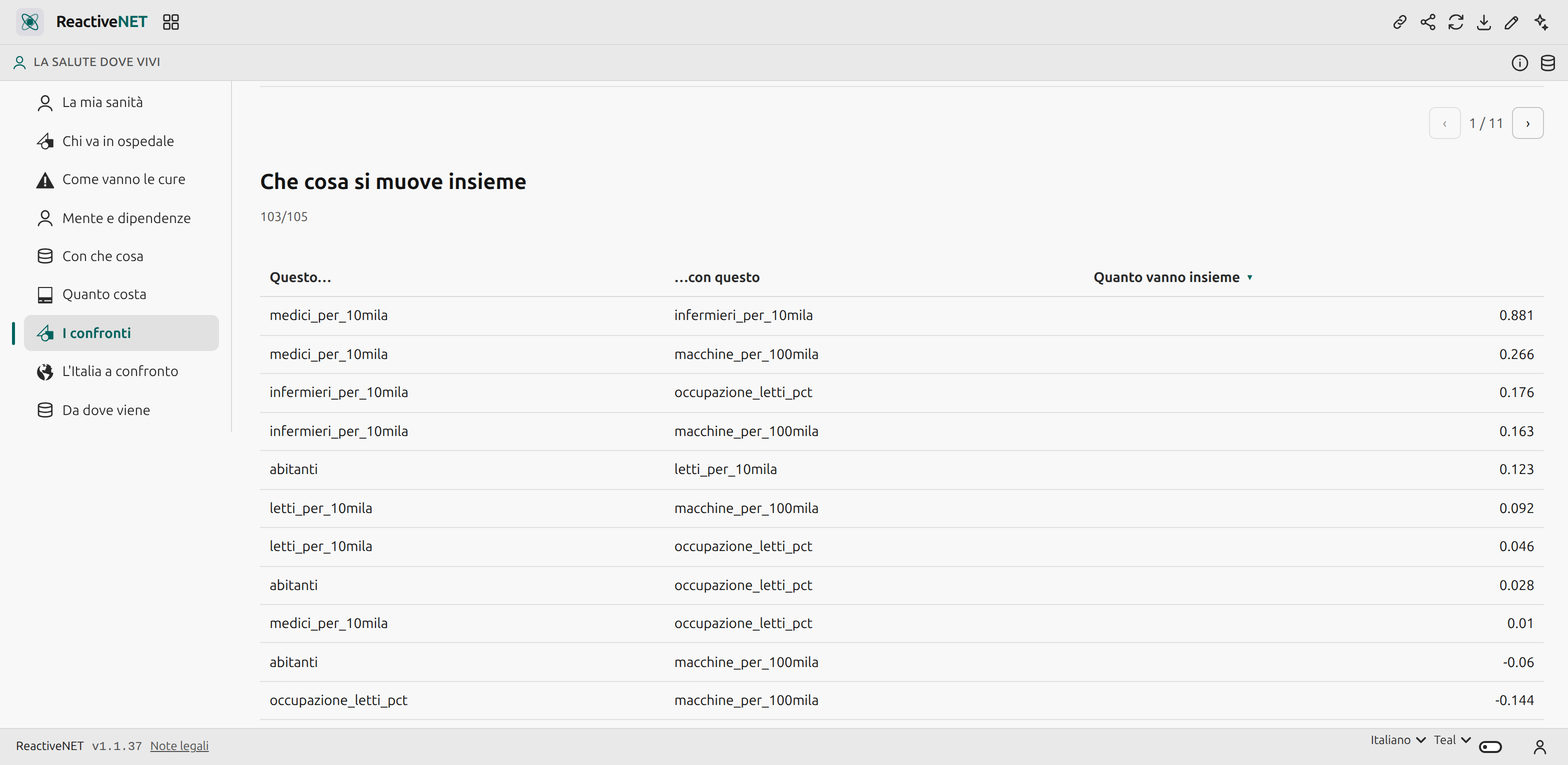
Comparisons puts the hundred and five comparable health authorities side by side and runs three models in the browser: correlations across the indicators, anomaly detection, and a clustering.
The anomaly page is also a lesson in how to read a model, because the two things it finds are both false alarms, of different kinds. At the top come Rome’s authorities with two hundred beds per ten thousand residents: Rome is split among several authorities but its large hospitals serve the whole city, and the denominator is only a slice of the population. Just below come Lombardy’s ATS with fewer than one doctor per ten thousand: there the ATS buys care and the staff sit in separate ASST bodies.
In both cases the model found the denominator, not the health service. That is why an automatic ranking of health authorities is not in this app and will not be.
The five things to know
The last page lists them, and they are the ones that make a correct number read wrongly: beds per resident must be computed over the catchment and never the municipality; the ratio of deaths to discharges is not a hospital’s mortality; empty cells are not zeros but figures suppressed to avoid identifying people; the doctors-per-resident ratio is not comparable across regions that organise the service differently; and a heavily used service is not a failing one — for mental health the opposite of the instinctive reading is true.
Where the data comes from
Ministry of Health (authorities, hospitals, beds, staff, equipment, family clinics, mental health, addiction, hospital discharges, pharmacies — all under the IODL 2.0 licence), AGENAS (care outcomes), the Treasury (authority spending from SIOPE flows), and ISTAT (population, boundaries, cause-of-death mortality, life expectancy and infant mortality by province).
Yours to change
An app is a Markdown document: open it, edit it by hand, or ask the assistant to change it for you. Whatever you add stays on your device.