
Catalogue app
Italian schools in numbers
How many pupils you will have, not just how many you have. Six dashboards over five official sources that join up by municipality, province and region — and run entirely in your browser.
The app travels inside the link: it opens in your browser and stays there. No account, nothing to install, and none of your data passes through a server.
The app is written in Italian, because the data it reads is Italian and so are the people it is for. Everything below describes what it does.
What it does
Five official sources, six pages, a different question on each.
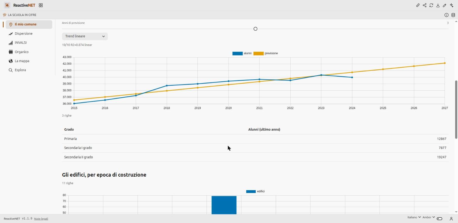
My municipality starts from a search by name and lines up what you need in order to plan: today’s pupils and how that number moved over ten years, state schools and buildings on record, their average year of construction and how many sit in seismic zone 1 or 2. Below that, the figure that actually drives staffing: the enrolment series extended forwards, with the horizon set by a slider and the model chosen from a menu — linear trend, ARIMA/SARIMA or Holt-Winters.
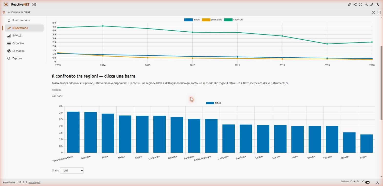
Dropout shows the national series from 2013/2014 for middle school, the transition between cycles and upper secondary, then the regional ranking for upper-secondary dropout. That ranking is clickable: it is real cross-filtering, the kind business-intelligence tools do — pick a region on the chart and the detail table narrows, click again and the filter is gone.
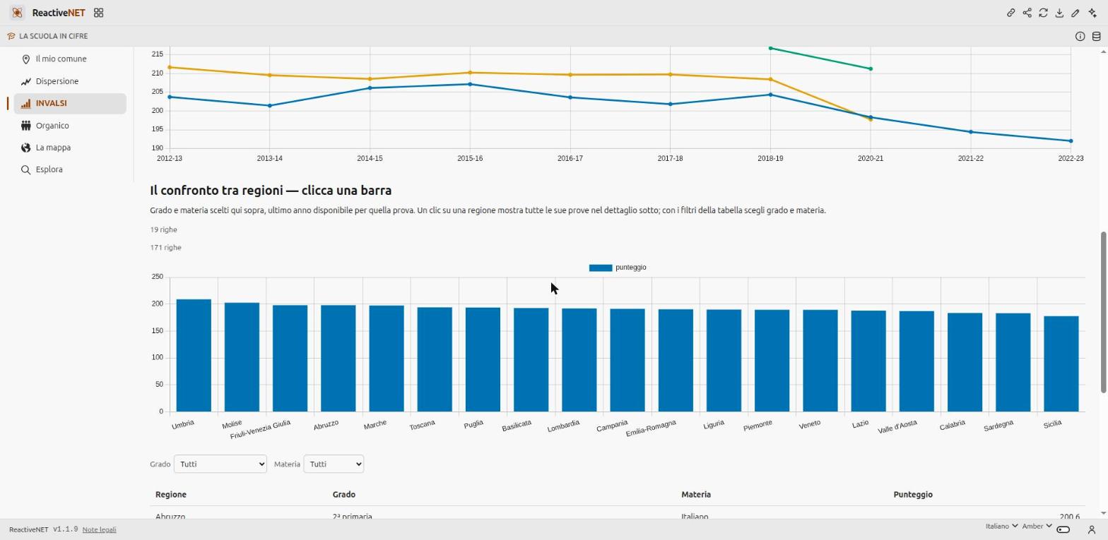
INVALSI compares Italian and mathematics along the whole path, from year 5 of primary to the final year of upper secondary, with level and subject chosen by the reader rather than decided by the author. Staffing does for teachers what the first page does for pupils: tenured staff by province, the pupil-teacher ratio, the share of support-teaching posts, administrative staff, the age distribution — where the retirement wave is plain to see — and the same projection applied to teachers.
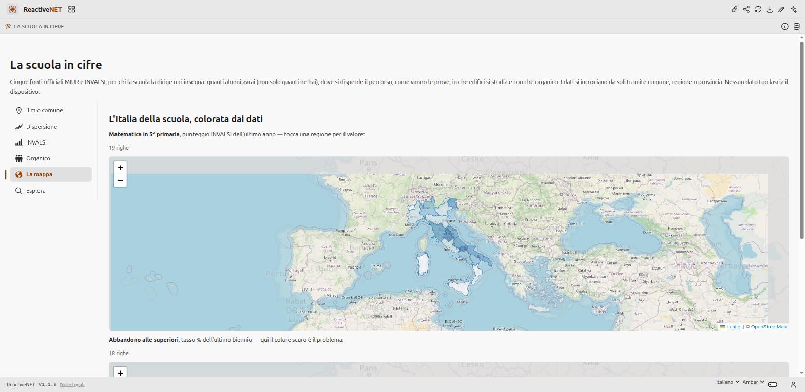
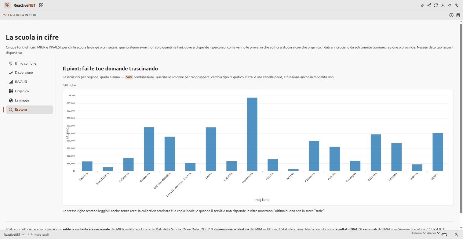
The map shades Italy twice, by score and by dropout, over ISTAT boundaries. Explore decides nothing: it puts 540 combinations of region, level and year into a pivot table you group, filter and chart by dragging the columns, even as a reader rather than an author.
Where the data comes from
Open and official, queried live:
| Source | What it provides | Licence |
|---|---|---|
| MIUR — Portale Unico dei Dati della Scuola | enrolments, school buildings, staff, the school register | Open Data IODL 2.0 |
| MIM — Statistical Office | dropout by region and school level | free reuse with attribution |
| INVALSI — Statistical Service | regional test results | CC BY 4.0 IT |
| ISTAT | municipal and regional boundaries | CC BY 4.0 |
They join up by municipality, province and region on their own, which is what makes it possible to divide a province’s teachers by the same province’s pupils without pasting two tables together by hand.
What the app does not claim, and why
Every page ends with its own caveats, and those are as much part of the document as the charts. Enrolments cover state schools only, and pre-school is missing from the source. The forecast is a trend, not an oracle: the R² in the status line says how much of the series that trend actually explains. The INVALSI figures are from a sample, on a WLE scale with a national mean around 200 — useful for comparing places and years, not for judging one school — and 2019/2020 is absent because the tests did not take place. Valle d’Aosta and Trentino-Alto Adige are missing from the dropout data for the whole series; Trentino appears in the INVALSI data as two autonomous provinces rather than as a region, which is why it stays blank on the map. The pupil-teacher ratio crosses two differently built sources and is an indicator of direction, not an official staffing figure.
How you change it
It is a Markdown document: open it in the editor and you can read all of it,
queries included. Changing a chart’s threshold, adding a column to a table or
swapping a SELECT are one-line edits. The assistant can make them for you
if you would rather describe them in words.
The data the app fetches stays in your browser and works offline too: when the service is unreachable, the pages show the last copy they received and say that it is stale, rather than an error on top of numbers that look fresh.
Yours to change
An app is a Markdown document: open it, edit it by hand, or ask the assistant to change it for you. Whatever you add stays on your device.